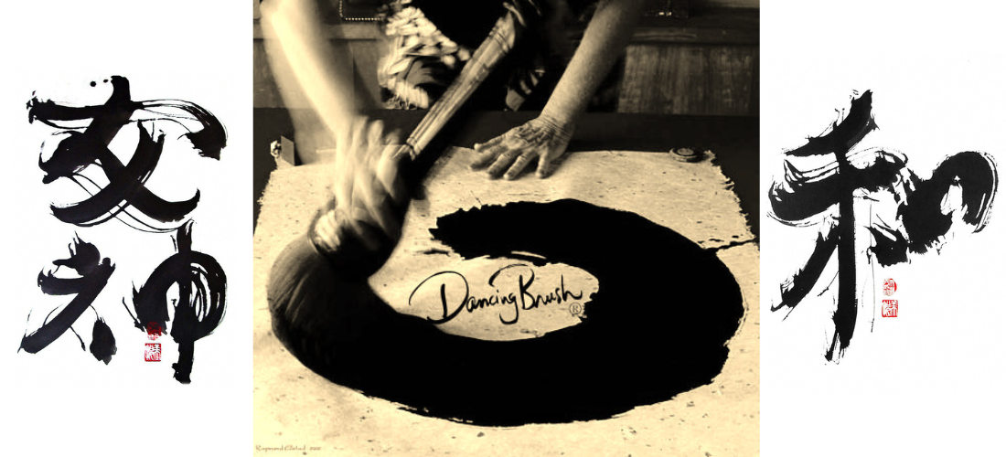
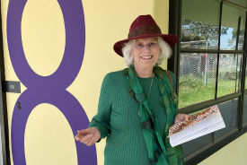
Welcome to Dancing Brush® of Cardiff by the Sea, a sanctuary of creative expression nestled along the northern coastal shores of San Diego. Founded and lovingly nurtured by the visionary Contemporary Zen Painter and Teacher, Rosemary KimBal, our space is a living canvas where art, mindfulness, and personal growth intertwine.
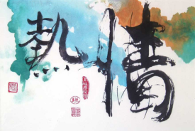
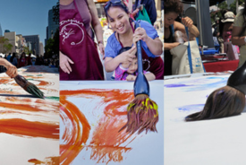
For over five decades, Dancing Brush® has been a beacon for those seeking to explore the profound depths of Brush Painting in the Asian tradition. We offer a wide range of experiences — from intimate workshops and thought-provoking seminars to dynamic demonstrations and one-on-one consultations. Our offerings transcend mediums, inviting you to immerse yourself in Ceramics, Watercolor, Photography, Printmaking, Journaling, and more.
The essence of our mission is to nurture the soul through creativity. We embrace the ancient arts of Tai Chi and Feng Shui, cultivating balance and serenity, while Chinese Face Reading invites a deeper connection to the self. Whether you’re a seasoned artist or a curious soul, our space is a haven for exploration, inspiration, and transformation.
Join us in this vibrant community, where every stroke of the brush, every movement, and every moment is a step towards greater harmony and artistic freedom. Thank you for being part of this journey of discovery.